 "philipilihp" (philiphilip)
12/06/2013 at 12:53 • Filed to: Pagani, Typolopnik
 2
2
 22
22|
"philipilihp" (philiphilip)
12/06/2013 at 12:53 • Filed to: Pagani, Typolopnik | 2
| 22 |
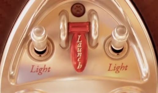
You're car is so expensive. Why is your typography so cheap?
 Yowen - not necessarily not spaghetti and meatballs
> philipilihp
Yowen - not necessarily not spaghetti and meatballs
> philipilihp
12/06/2013 at 12:58 |
|
Lol I thought it was a beer tap at first.
 Bad Idea Hat
> Yowen - not necessarily not spaghetti and meatballs
Bad Idea Hat
> Yowen - not necessarily not spaghetti and meatballs
12/06/2013 at 13:05 |
|
That's the world's worst beer tap, then.
|
Yowen - not necessarily not spaghetti and meatballs
> Bad Idea Hat
12/06/2013 at 13:06 |
|
Light Beer or Light Beer, or Launch in your face beer.
|
Yowen - not necessarily not spaghetti and meatballs
> philipilihp
12/06/2013 at 13:06 |
|
Exposed fastener? OH NO!
|
Bad Idea Hat
> Yowen - not necessarily not spaghetti and meatballs
12/06/2013 at 13:10 |
|
Bud Light, Coors Light, NATTY ICE NOOOOOOOooooo.....
 soto
> philipilihp
soto
> philipilihp
12/06/2013 at 13:10 |
|
Could be worse...
|
Yowen - not necessarily not spaghetti and meatballs
> Bad Idea Hat
12/06/2013 at 13:12 |
|
Miller Highlife, Milwaukee's best and Beer 30....
THat would be even worse.
|
Bad Idea Hat
> Yowen - not necessarily not spaghetti and meatballs
12/06/2013 at 13:17 |
|
I had completely forgotten about Beer 30. I mean...why. Why did they?
 rad_mike
> philipilihp
rad_mike
> philipilihp
12/06/2013 at 13:32 |
|
I find the Huayra interior so strangely awful. I've never seen one in person, but in pics it look like a plastic GM interior. Steampunk meets plastic. Such a strange aesthetic on such an amazing piece of engineering.
|
philipilihp
> Bad Idea Hat
12/06/2013 at 13:33 |
|
Yeah i prefer the Tesla doorhandle beer tap.
|
philipilihp
> soto
12/06/2013 at 13:33 |
|
Hahahaha no one has ever been more right!!
 Mattbob
> philipilihp
Mattbob
> philipilihp
12/06/2013 at 13:34 |
|
This seriously looks like a childs toy. Like something from some sort of little princess playset.
|
philipilihp
> Mattbob
12/06/2013 at 13:39 |
|
So much for "every piece has to be perfect." He could have hired even a middling graphic artist to typeset this.
 mambochapchap
> philipilihp
mambochapchap
> philipilihp
12/06/2013 at 13:46 |
|
Much as I love Pagani's work, this has always bothered me. There are some design decisions he makes that are a little curious, but I dismiss them because they do not detract much from the whole.
|
Yowen - not necessarily not spaghetti and meatballs
> Bad Idea Hat
12/06/2013 at 13:58 |
|
I dunno, I bought a case once, thinking it'd be like any other cheap beer, boy was I wrong, beer 30 reinvented cheap beer.
Luckily nobody at the time knew how bad it was yet, for some strange reason they wanted to know, I was at a pool party and traded almost every one of them.
|
philipilihp
> mambochapchap
12/06/2013 at 13:59 |
|
Sadly stuff like this bothers me way more than it should. Don't get me wrong, I wouldn't kick it out of my garage, but it would definitely bug me as I propel myself forward using the ugly launch control button.
I could be totally wrong on this, but this might be a case of Horacio Pagani himself wanting to have the final say on every single piece, even though it isn't necessarily his area of expertise.
 It's a "Porch-uh"
> soto
It's a "Porch-uh"
> soto
12/06/2013 at 14:08 |
|
Papyrus would have also been an acceptable answer.
Also, vertical type?! Somebody over there should be sacked.
|
soto
> philipilihp
12/06/2013 at 15:35 |
|
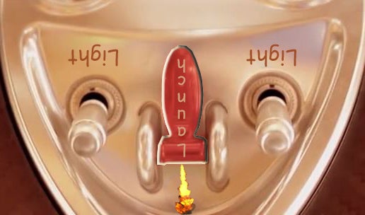
Figured it out!
|
philipilihp
> soto
12/06/2013 at 15:38 |
|
You are on a roll, my friend!! Looks like a farting hindenburg, but I definitely get your point.
 Flat Six
> philipilihp
Flat Six
> philipilihp
12/06/2013 at 16:50 |
|
It kind of looks like a font you might see at a fancy restaurant menu.
Fancy like Olive Garden.
|
philipilihp
> Flat Six
12/06/2013 at 17:05 |
|
Mmmm breadsticks....
 davesaddiction @ opposite-lock.com
> philipilihp
davesaddiction @ opposite-lock.com
> philipilihp
12/06/2013 at 18:34 |
|
How does it look in Italian?